#3345 closed bug (upstream)
Bug: Spacing is messed up in composer labels
| Reported by: | Alister | Owned by: | mhugent |
|---|---|---|---|
| Priority: | major: does not work as expected | Milestone: | Version 1.7.0 |
| Component: | Printing | Version: | Trunk |
| Keywords: | Print, Composer labels, font | Cc: | |
| Must Fix for Release: | No | Platform: | All |
| Platform Version: | Awaiting user input: | no |
Description
(Maybe this should be priority="critical" as you could say the printed output is "corrupted")
When printing from the composer (either to paper or to a virtual PDF printer) the letter spacing is messed up in some composer labels. See attached screenshot. Exporting to SVG is OK.
I haven't seen the same problem in legend text or map labels, but maybe I just haven't tested enough (I always export to SVG due to this problem and others).
I'm guessing this bug could be related to r7364 or even #2937
Attachments (7)
Change History (20)
by , 13 years ago
| Attachment: | title_messed_up.PNG added |
|---|
comment:3 by , 13 years ago
| Owner: | changed from to |
|---|
It is a bug in the Qt library. However, in the composer, we use a workaround for it (request larger fonts and downscale the painter). So maybe the workaround needs to be improved or fixed for the label.
comment:4 by , 13 years ago
Hm, difficult to reproduce. Maybe it only happens with some fonts / fontsizes? Could you attach an empty project that contains no layer, just one composer with one label where the problem occures? Also, do you use the composer pdf export or the pdf printer in the print dialog (and which one on which OS)?
comment:5 by , 13 years ago
Maybe it only happens with some fonts / fontsizes?
Ah, yes. It occurs with Calibri, but not with a couple of other fonts I've tested now. It does not seem to depend on font size.
It looks like there may actually be a couple of separate issues:
- Spaces being inserted (This can be demonstrated by printing to PDF, opening the output file and copying into a text editor).
- Some characters missing (The question mark ? on the first line of this example).
- Some characters being too close together.
Also, do you use the composer pdf export or the pdf printer
A separate pdf printer, from the print dialogue. This is in Windows XP, and the problem occurs with both the Adobe printer and the PdFill printer (which uses ghostscript). But it also occurs if I use a real printer to print to paper.
by , 13 years ago
| Attachment: | faulty_composer_label.qgs added |
|---|
example project with faulty composer labels
comment:6 by , 13 years ago
It isn't just Calibri - I've now found another couple of fonts that also exhibit the problem. These ones are called "Candara" and "Constantia".
comment:7 by , 13 years ago
I tested it with the Qt pdf export and the system pdf printer on ubuntu. Both produce output as expected. Don't know if it might be a problem in the gdi print engine of Qt.
The Qt pdf export should give the same results on all platforms. It does however rasterize the text (I guess that's why you use a gdi pdf printer instead).
comment:8 by , 13 years ago
Both produce output as expected.
Interesting. Do you actually have the Calibri font installed?
The Qt pdf export should give the same results on all platforms. It does however rasterize the text (I guess that's why you use a gdi pdf printer instead).
Yes. There were also a number of bugs with the built-in pdf export, but I can't remember if any are still open. Note that this is not a PDF problem - it also occurs when I print to a real printer.
comment:9 by , 13 years ago
Interesting.
I no longer get the same results with the test file. But there is still a problem. The f in the first line is stretched and joined to the i. I get the same result in Windows and Linux, whether using the button to export to PDF, or printing. I'll attach some new examples.
by , 13 years ago
by , 13 years ago
| Attachment: | document1.2.pdf added |
|---|
by , 13 years ago
| Attachment: | document7.zip added |
|---|
by , 13 years ago
| Attachment: | calibri.PNG added |
|---|
comment:10 by , 13 years ago
| Platform: | Windows → All |
|---|---|
| Platform Version: | XP |
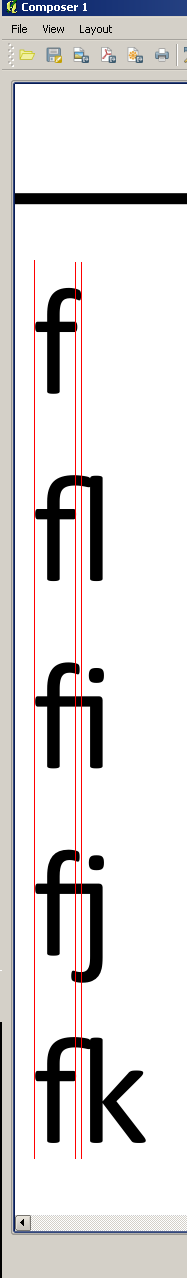
I think this is probably a different bug from what I originally reported, because I can actually see it in the composer (see calibri.PNG), not just in the printouts.
The top of the f is stretched if there is an l or a k to the right, and the middle is stretched if there is an i or a j to the right.
This occurs only with fonts that exhibited the original bug (e.g. "Calibri", "Candara" and "Constantia").
comment:11 by , 13 years ago
| Resolution: | → upstream |
|---|---|
| Status: | new → closed |
The same effect shows up using these fonts in Gnumeric in Linux, so I assume this is a freetype issue.
If the original problem shows up again I'll reopen.
comment:12 by , 13 years ago
Sorry, I meant abiword, not gnumeric :)
Testing with ftview and ftstring does not show the same problem, so I guess it is something about the way QT (and GTK for abiword) are using freetype.
comment:13 by , 13 years ago
Hmmm, I'm guessing this is something to do with opentype kerning: http://web.archiveorange.com/archive/v/QpqYzHxnWiKoob2ztzE9
FT_Get_Kerning only has access to the old "kern" TrueType table, which Calibri does not include. Kerning in Calibri is realized only using the modern "kern" feature implemented in the "GPOS" OpenType table. To access that table, you should use an OpenType Layout engine such as HarfBuzz, Pango, ICU Layout, Uniscribe, Bitstream Panorama or Monotype WorldType, before you use FreeType to perform the glyph imaging.
This is a good idea anyway. FreeType is useful to perform glyph imaging, but its text layout abilities are very limited.
screenshot of composer label with messed up font spacing