Opened 6 months ago
Closed 6 weeks ago
#2485 closed task (fixed)
version 17 create osgeo_menu image for the desktop
| Reported by: | astrid_emde | Owned by: | |
|---|---|---|---|
| Priority: | critical | Milestone: | OSGeoLive17.0 |
| Component: | OSGeoLive | Keywords: | |
| Cc: | osgeolive@… |
Description 
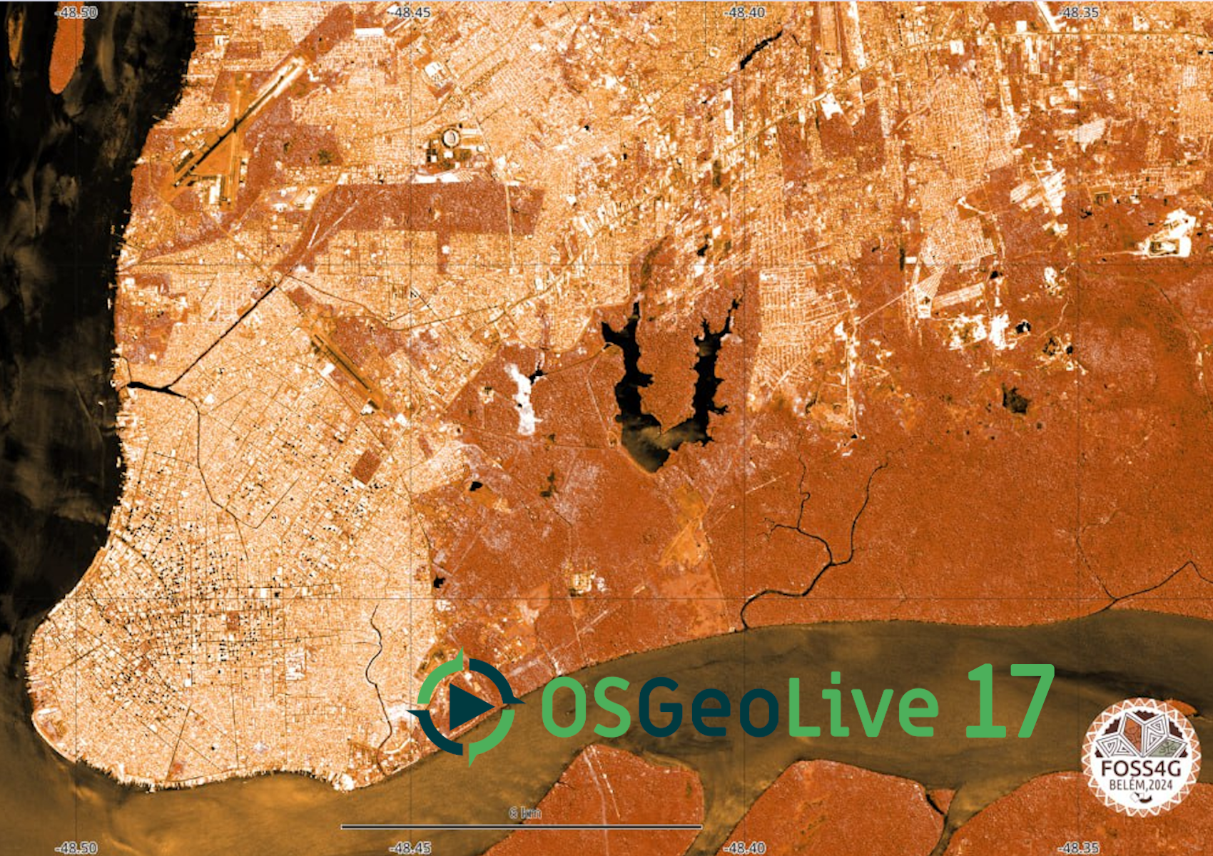
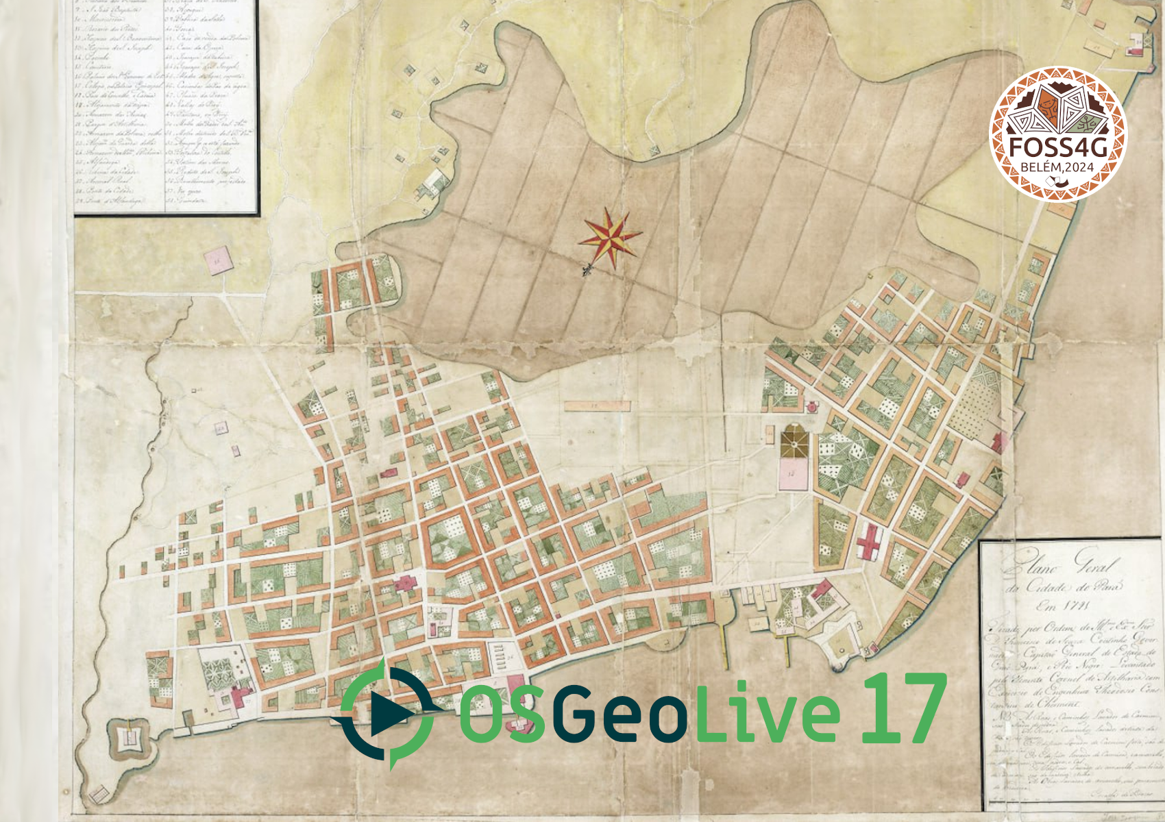
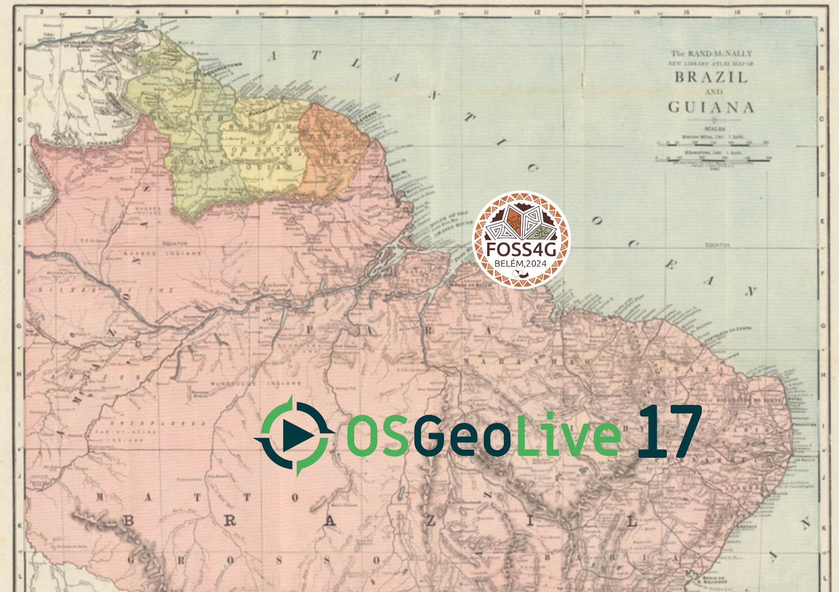
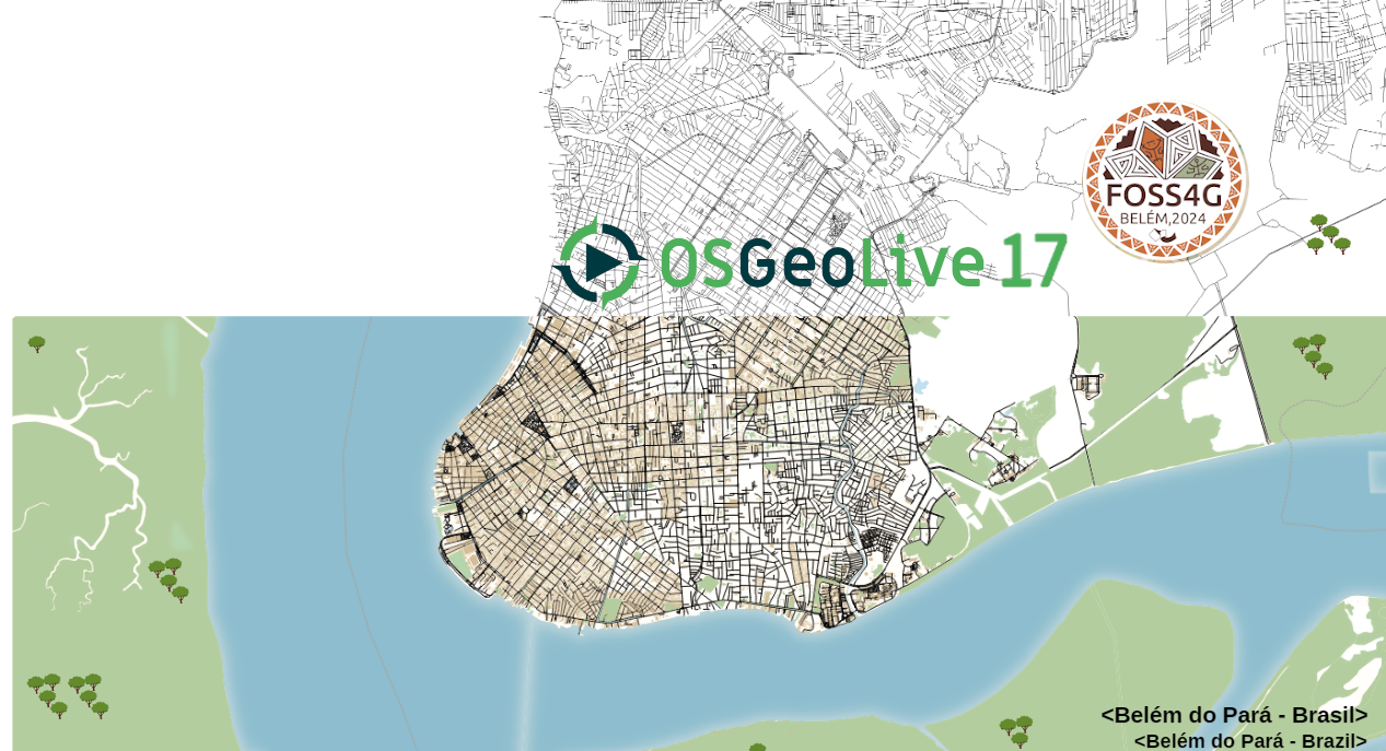
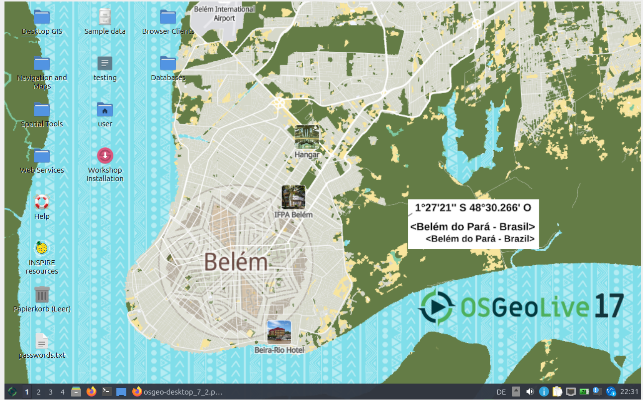
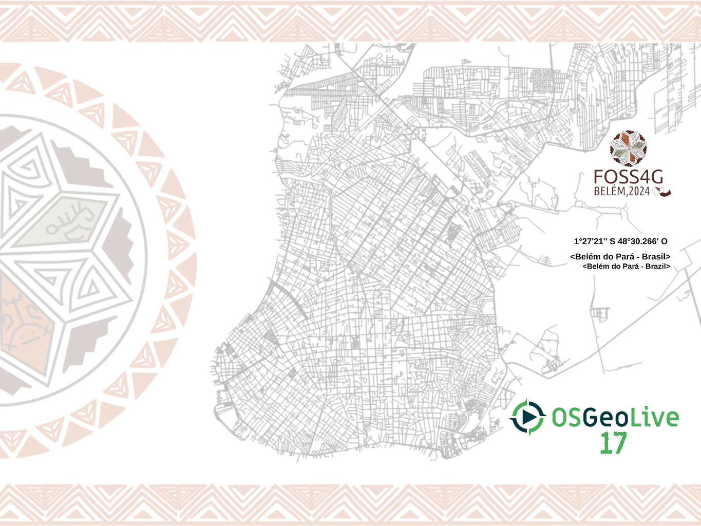
we need a desktop background image for version 17. We asked the FOSS4G Bèlem team for input. They have send some maps that we could use.
Change History (50)
comment:1 by , 6 months ago
by , 6 months ago
| Attachment: | osgeo-desktop_1.png added |
|---|
by , 6 months ago
| Attachment: | osgeo-desktop_2.png added |
|---|
by , 6 months ago
| Attachment: | osgeo-desktop_3.png added |
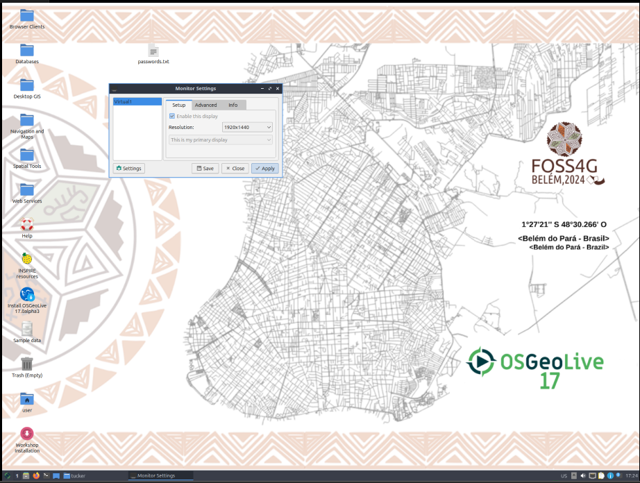
|---|
by , 6 months ago
| Attachment: | osgeo-desktop_4.png added |
|---|
comment:3 by , 6 months ago
moin Astrid,
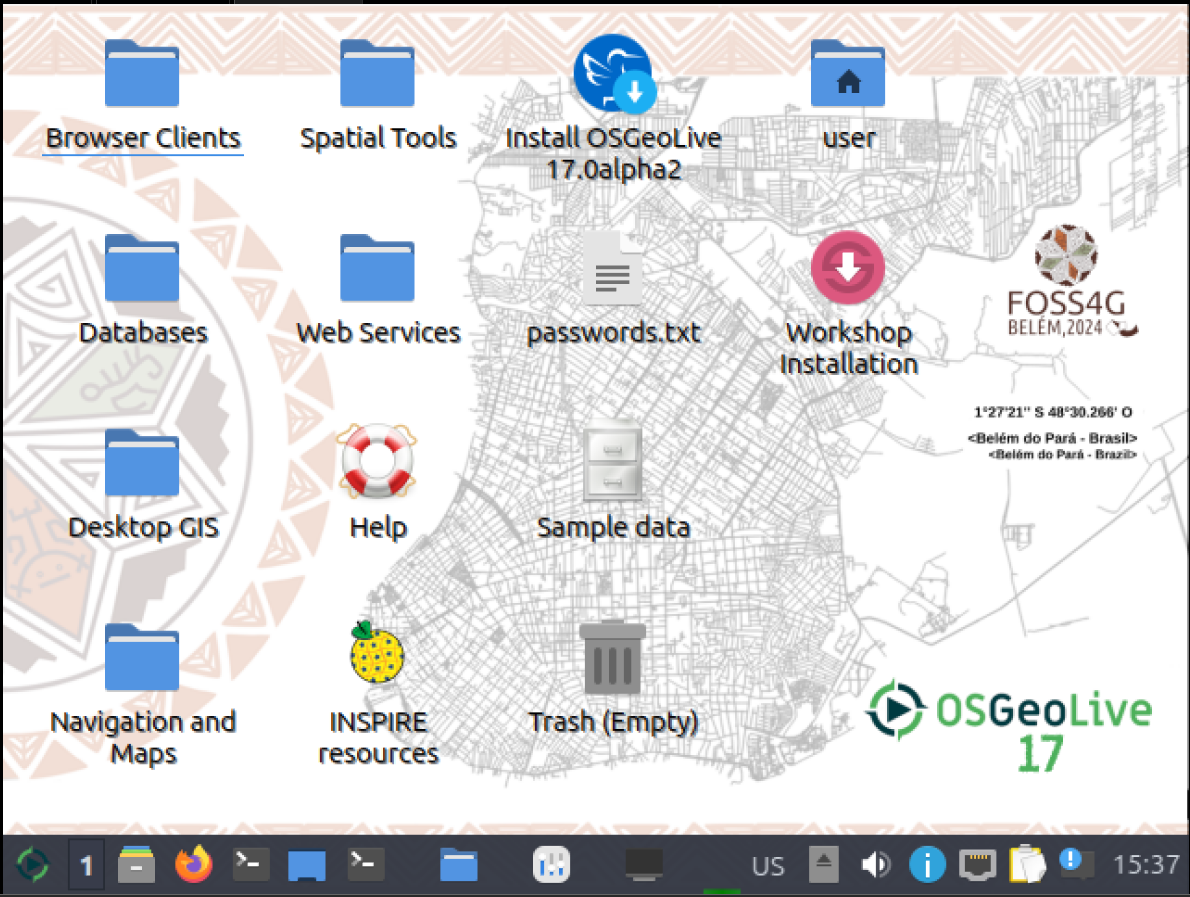
wrt. to desktop icon visibility/readability a dark map is better. we could add some dark translucency on the left side where icons reside to mitigate that. from your suggestions desktop_1 looks darkest.
additionally i'd add some outline to the OSGeoLive Logo also to make sure it is clearly visible even if the color behind matches it to closely.
i can do the steps above if you provide the source images if you want to.
comment:4 by , 6 months ago
by , 6 months ago
| Attachment: | osgeo-desktop_5.png added |
|---|
by , 6 months ago
| Attachment: | osgeo-desktop_6.png added |
|---|
comment:5 by , 6 months ago
| Cc: | added |
|---|---|
| Milestone: | → OSGeoLive17.0 |
| Priority: | normal → critical |
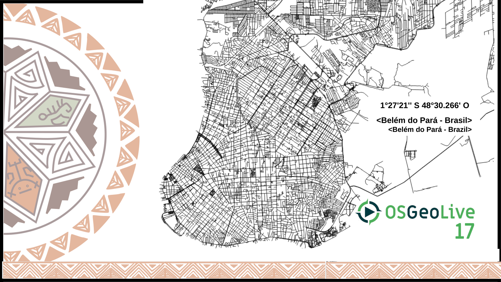
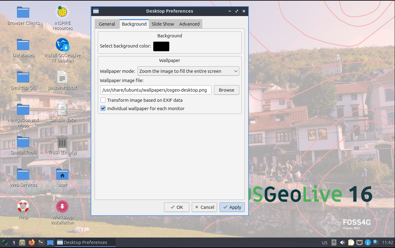
I like both 5 and 6. 5 has the FOSS4G full logo but the OSGeoLive logo is too high I would prefer 6 for the desktop
Any other opinions/preferences?
by , 6 months ago
| Attachment: | osgeo-desktop_6.notes.png added |
|---|
comment:6 by , 6 months ago
comment:7 by , 6 months ago
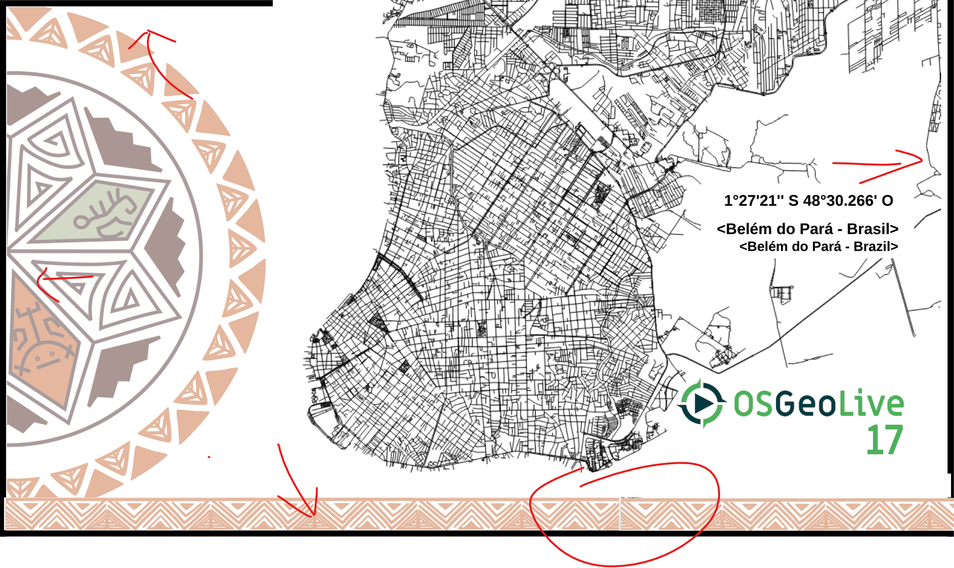
like osgeo-desktop_6 as well. just a few notes
- i seem to remember that we need a specific size/aspect-ratio for the default background
- osgeo-desktop_6 needs some fixing of the borders (s.b.) there are black leftover areas
- the bottom ornamental band can be extended a bit neatly, there seems to be some leftover black content behind it as well (s.b.)
comment:8 by , 6 months ago
Hello,
thanks a lot for the feedback.
I like number 6 too.
More feedback from the @osgeolive team members?
If we take number 6 as final I can work on the final image.
- what is the size/aspect-ratio for the default background
- fix border -> yes
- ornament fixes / foss4g logo move upwards
- thanks for the suggestions in the notes images - all good
I wrote a mail to the FOSS4G team waiting for their go. And then I ca nwork on the final image.
by , 6 months ago
| Attachment: | Screenshot 2024-11-01 124301.png added |
|---|
by , 6 months ago
| Attachment: | Screenshot 2024-11-01 124228.png added |
|---|
comment:9 by , 6 months ago
wrt. 1. you can probably take the last desktop images as orientation https://github.com/OSGeo/OSGeoLive/commit/35916cc2b79d98ae830cf3f6a423a38ad4a817a9
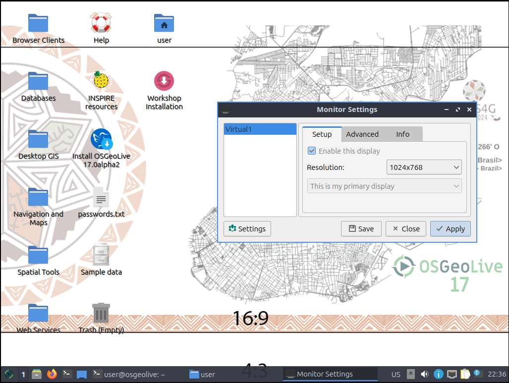
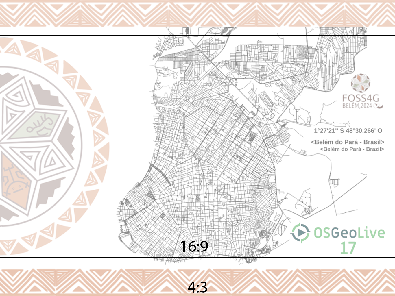
professionally i'd suggest to design for a 3:2 (or 4:3) ratio and layout logo etc. so that it can be zoomed in safely as 16:9. the lubuntu desktop supports "Zoom to image to fill entire screen". that should cover the basic setups.
WallpaperMode=zoom would the need to be added here
https://github.com/OSGeo/OSGeoLive/blob/master/bin/install_desktop.sh#L47
comment:10 by , 5 months ago
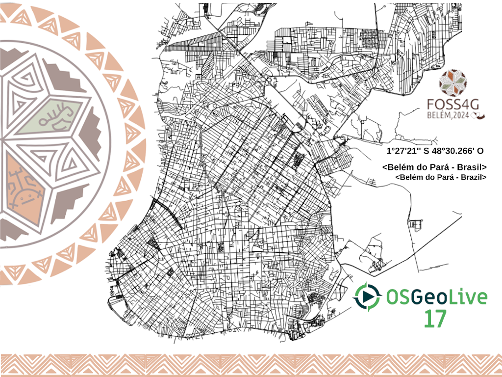
I received a new map from the FOSS4G team and worked on a new version of desktop 6.
Feedback please.
See version_6_2
- size 1024x768
by , 5 months ago
| Attachment: | osgeo-desktop_17_1024_768_version_6_2.png added |
|---|
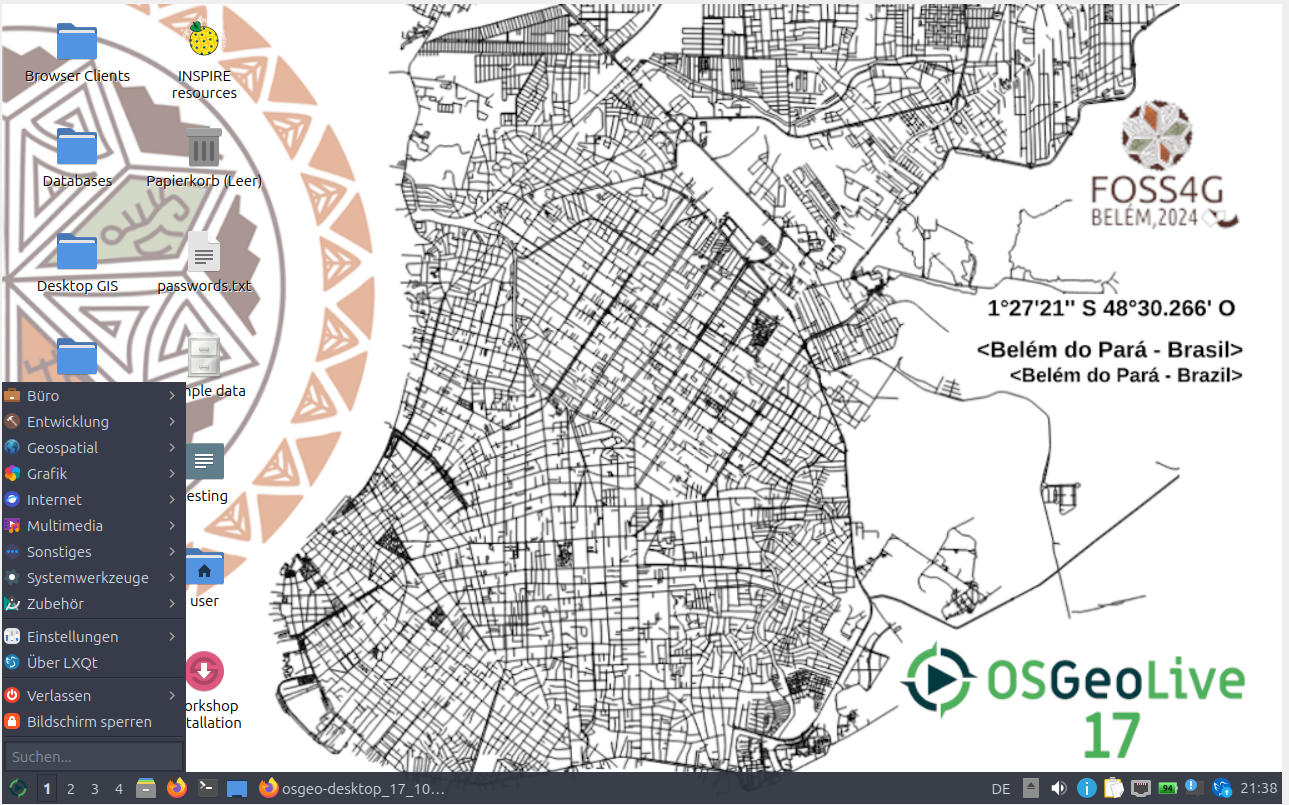
by , 5 months ago
| Attachment: | desktop_version_6_2_live.png added |
|---|
6_2 see how the desktop would ok like
comment:11 by , 5 months ago
comment:12 by , 5 months ago
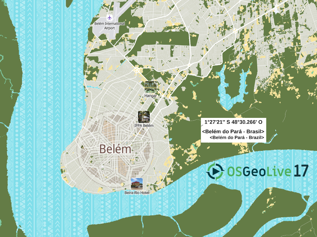
I created a version 7
- map was taken from https://2024.foss4g.org/en/map/#12/-1.44585/-48.47279
- what do you think about the version 7
- the map needs a different version without the photo marker
- for better readability the map could move more to the left to have the icons on the blue background
by , 5 months ago
| Attachment: | osgeo-desktop_7_2.png added |
|---|
by , 5 months ago
| Attachment: | desktop_7_2_screenshot.png added |
|---|
by , 5 months ago
| Attachment: | 43-1024x768.png added |
|---|
by , 5 months ago
| Attachment: | 169-1280x720.png added |
|---|
by , 5 months ago
| Attachment: | typo-colors.png added |
|---|
comment:13 by , 5 months ago
hey Astrid,
i took your design and tried to visualize some enhancements. just quick hacks nothing fancy.
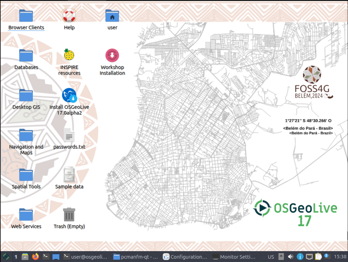
- i reduced the opacity of the background elements to 50% for the icons and labels to become better readable (logo etc. should be excluded, for simplicity sake i didn't)
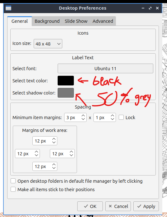
- desktop label text colors changed to black with grey50 outline
- design for 4:3 but with the possibility of cropping top/bottom to 16:9 in mind (see below). keeping the cute bottom border for 4:3 only would probably be a good idea. having the map start from the very top probably as well.
hope that helps.
design a 4:3 with borders on top/bottom
that when cropped in a 16:9 resolution still works
by , 5 months ago
| Attachment: | osgeo_quickdraft_ratios-v2 copy.png added |
|---|
comment:14 by , 5 months ago
comment:15 by , 5 months ago
Hello @edso, thank you very much for your feedback. Sounds very good. I will check later today.
by , 5 months ago
| Attachment: | osgeo-desktop_17_version_6_with_opacity.png added |
|---|
comment:17 by , 5 months ago
looks good. but
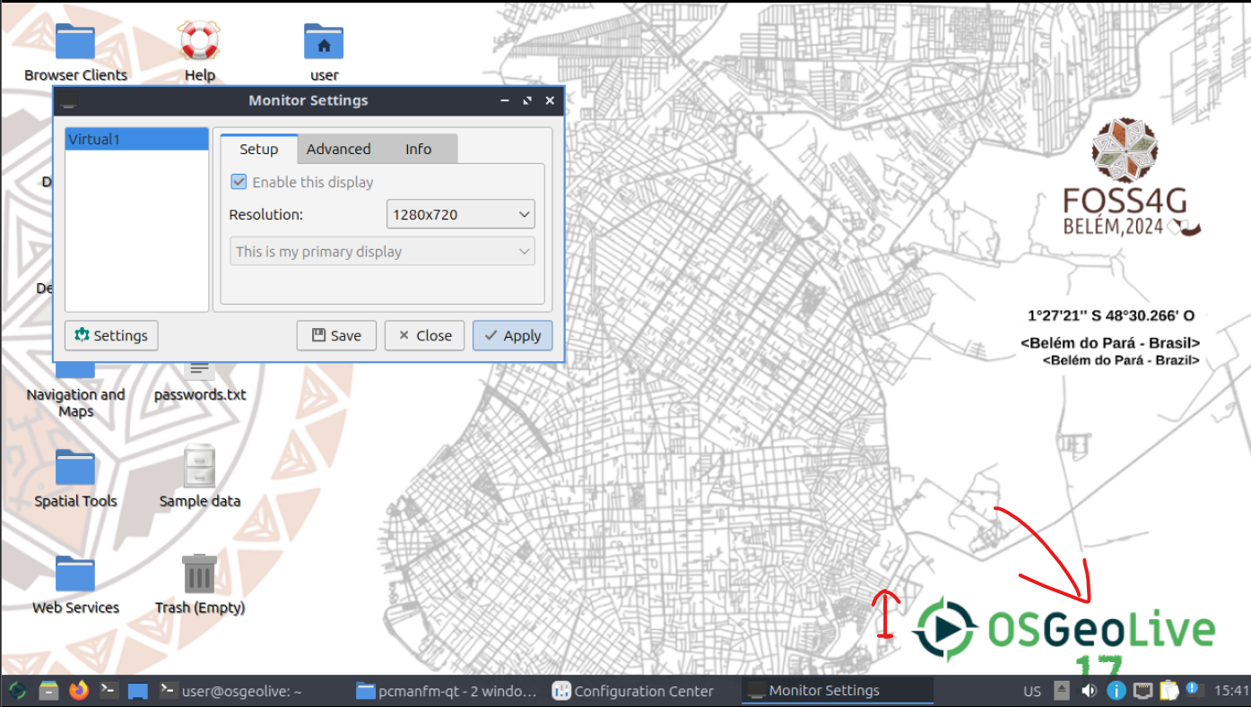
- something went wrong with the OSGeoLive 17 logo. the number has a corrupted outline.
- generally the logos could be bigger, maybe double the size
- and should be placed a little more image centered. older monitors tend to crop some pixels from the displayed content. usually 10% of width/height as distance are considered screensafe.
EDIT: just tested in a vm
- OSGeo logo needs to be put up as the taskbar overlaps it in 16:9 (see below) so maybe 20% distance to the bottom here to be safe
4:3 looks good
by , 5 months ago
| Attachment: | 640x480.png added |
|---|
by , 5 months ago
| Attachment: | 1024x768.png added |
|---|
by , 5 months ago
| Attachment: | 1280x720.169.png added |
|---|
by , 5 months ago
| Attachment: | 3840x2160.169.png added |
|---|
follow-up: 20 comment:18 by , 5 months ago
@edso - thank you for the feedback. I moved the logo and made a PR for the next build. Hope it is ok now.
@edso - maybe you could work on the desktop image for version 18 :)
comment:19 by , 5 months ago
comment:20 by , 5 months ago
Replying to astrid_emde:
@edso - thank you for the feedback. I moved the logo and made a PR for the next build. Hope it is ok now.
if you attach i could doublecheck it
@edso - maybe you could work on the desktop image for version 18 :)
well, i offered in comment 3 already, but without source images there's little to do.
maybe a joint effort next time on a shared file platform, exchanging XCF/PSD until we are satisfied?
wrt. the PR
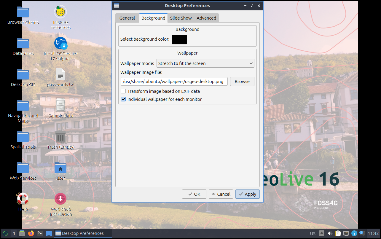
we will need to modify the desktop settings for the image to work properly, namely
Wallpapermode -> zoom
FgColor -> #000000
ShadowColor -> #7f7f7f
with changes to be applied here https://github.com/OSGeo/OSGeoLive/blob/master/bin/install_desktop.sh#L47
holler if you need me to prepare a PR to that regard.
by , 5 months ago
| Attachment: | 169-1920-alpha3.png added |
|---|
by , 5 months ago
comment:21 by , 5 months ago
ok, just received the alpha3 sporting the change
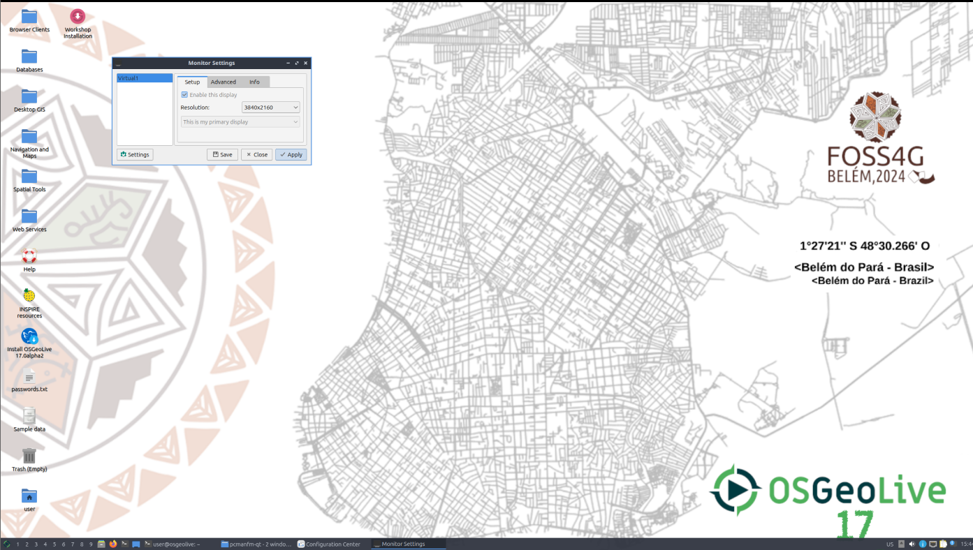
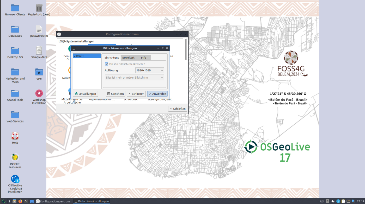
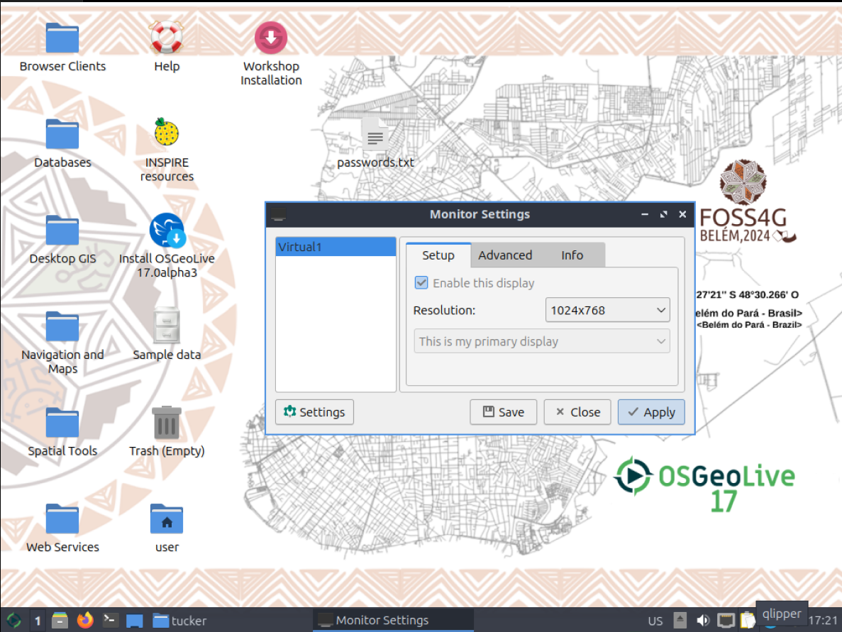
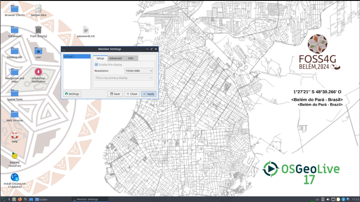
Version 17.0alpha3
====================
 * Desktop image for FOSS4G 2024 Belem
at this point i'd suggest @astrid_emde to simply provide the source images/composition for me to finalize it. it might save some back and forth in this thread. while positioning is better, it
- still has the outline issue on the number 17 (see screenshots).
- generally logos that seem more blurry than necessary
- as mentioned above,
Wallpapermode,FgColor,ShadowColorneed to be patched.
if you provide me the needed source data i will happily come up with a PR on github :)
by , 4 months ago
| Attachment: | osgeo1213-1024x768.png added |
|---|
by , 4 months ago
| Attachment: | osgeo1213-1920x1080.png added |
|---|
by , 4 months ago
| Attachment: | osgeo1213-1920x1440.png added |
|---|
comment:22 by , 4 months ago
finishing touches are up as PRs on github https://github.com/OSGeo/OSGeoLive/pull/416 https://github.com/OSGeo/OSGeoLive/pull/415
the result should look like these
comment:23 by , 6 weeks ago
| Resolution: | → fixed |
|---|---|
| Status: | new → closed |



First two suggestions. More will follow -1. -2.